Love it or hate it, the Navigation Menu icon or ‘Hamburger Icon’ is here to stay. It’s synonymous with mobile apps and mobile websites, and with this ever-growing market, it will be a common visual on all mediums in the future, if not now. But is this really true? Is everyone now ‘stuck’ with this icon? Why do we have to stick to a choice between one icon vs words?
History
According to Gizmodo, the Navigation Menu icon was originally designed by Norm Cox in the ’80s for the Xerox "Star" personal workstation, one of the earliest graphical user interfaces. So the icon has pedigree; it’s been used for years without complaint, without hundreds of blogs on its bad/good UX, so why is everyone so angry about it now?
There have been a few tests on whether users understand the icons' meaning and whether using the word "menu" would be better, with very mixed results.
James Foster - Hamburger vs Menu: The Final AB Test reported about an in-depth A/B test on the icons against the word 'Menu' on the website Caffeine Informer and came out with a clear conclusion…
"The MENU button was clicked by 20% more unique visitors than the HAMBURGER button."
BUT before the sounds of cheers from the UXUI community finishing ringing in my ears, we have another study by Booking.com - Would you like fries with that? which concludes…
"In our experiment, changing the icon to the word 'menu' had no significant impact on the behaviour of our users. With our very large user base, we are able to state with a very high confidence that, specifically for Booking.com users, the hamburger icon performs just as well as the more descriptive version."
Michel Ferreira / Booking.com
Note: I'm ignoring the fact that Booking.com slightly changed the design of their button as well as the wording/icon
We always assume the choices in our menu icons are simple. Hamburger Icon vs Words. But there are many different icons out there all pushing the same end goal of interacting with a navigation menu.
Apple's New Icon
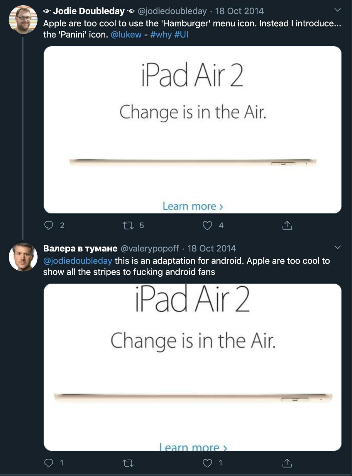
Apple introduced a new menu icon on its website for mobile users during its launch of the new, thinner iPad Air 2. The 2-line menu icon (Now dubbed the 'Panini' icon by Jack Crawford) puzzled me. Was this Apple trying to be unique? Were they trying to buck the trend and create a menu icon just for them?
Would we start seeing this icon appear on the millions of iOS devices in the future? Why has Apple ditched the top of their hamburger?
I thought I would raise the point on Twitter…

This a beautiful thought and would be a very geeky joke by Apple, using a menu icon to promote a thinner product by creating a 'skinny' hamburger icon or open-top sandwich, removing the top bun of the hamburger. Would Apple really risk their UX for a joke?
Apple aren't short-sighted, they have made their money through beautiful designs of hardware and software alike and they know their audience well. Most visitors to the Apple site on the launch of a new product will be tech-savvy users who will generally understand where a menu is on a website, and what kind of symbols to look out for. But it still strikes me as an odd thing to do, get something that is criticised and make it even more ambiguous than before.
My own opinion is that Apple made the icon just to create a small but neat animation. When you click on the 'Panini' the two lines twist together and turn into a cross, allowing the user to quickly close the menu they have just opened. A simple but quite beautiful effect is shown below.

What Icon to use - The definitive guide
The key thing to note with famous A/B tests on menu icons is that these tests were specific to their users, and we shouldn’t assume that what works for one website works for another. When talking to UXUI Engineers, most use the hamburger icon on their own projects because "it's standard now" or "Facebook trained a billion people on how to use it", so an icon that works on a Facebook mobile app will work on your website? Think again!
If you have an opinion on 'The Hamburger', 'The Panini', Androids 3-dot-icon or just the word 'Menu', then test all options thoroughly on YOUR OWN website with YOUR OWN users. You never know what the results might be, you might even be a little angered by them, but it’s what your users want.


