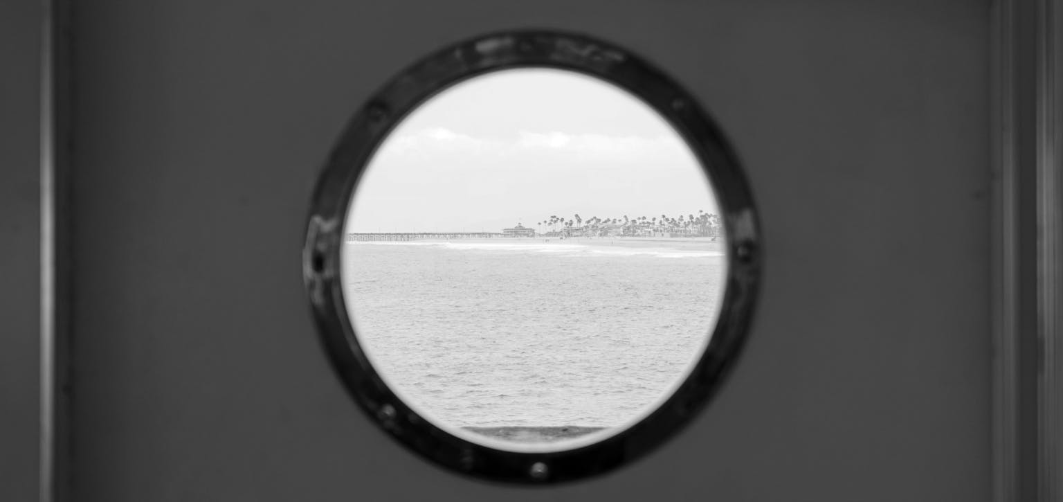
There is a new wave of design cropping up requiring a porthole or transparent CSS circle in block of colour over background image.
Here we look at one solution the CSS radial gradient
The problem
Let’s start by addressing the biggest problem… CSS gradients are background-images and therefore we can’t use one element to create the background image and gradient together. In this instance we need to use the css:after element to overlay the porthole onto the already existing background image in our element
.porthole {
  height: 600px; /* your desired height */
  position: relative;
  background: url('http://devben.ch/images/background4.png') no-repeat 0px center;
  -webkit-background-size: cover;
  -moz-background-size: cover;
  -o-background-size: cover;
  background-size: cover;
}
.porthole:after {
  /* Create your porthole here */
}
Radial Gradient
The CSS radial gradient is a function and therefore we need to specify arguments in the parentheses of this function to achieve the desired result.
Position
To start we want to position the transparent circle in the center of our element, this argument accepts any value that you can put in the background-position property, by default this is center center, but we will specify this anyway.
background-image: radial-gradient(center center);
Size
We want to make our porthole a perfect circle with height and width the same, for this we will use explicit size values, in this instance, we will use 200px 200px. The size is determined by the lengths of the horizontal and vertical axes of the radial’s shape, not the size of the shape itself. So to create a circle 400px wide, you need to use the size 200px as this will be the shape's radius.
background-image: radial-gradient(center center, 200px 200px) /* Creates a porthole 400px x 400px */
Note: Using 1 defined value will not work here
background-image: radial-gradient(center center, 200px);
Colours and Color Stops
We need transparency in this example so we could use HSLa for defining our colors or RGBa, it’s your choice which you use but in this example I’m using RGBa.
We start off by declaring the background color of our circle, in this instance the porthole will be full transparent, but with this in mind your porthole can be any colour and any level of alpha transparency you like. The color stop position is declared at the highest value smaller than your circle size so for this example you could use 199px or 99%. We will use 99% as we may want to increase or decrease the size or our circle at any time.
radial-gradient(center center, 200px 200px, rgba(0,0,0,0) 99%);
We then declare our secondary color, this will be the color covering the rest of the image with transparency. We then tell the function to cover the rest of the element using color stop at 100%.
radial-gradient(center center, 200px 200px, rgba(0,0,0,0) 99%, rgba(77,184,214,0.9) 100%);
Prefixes
As with anything remotely good in CSS, there will be some browsers which need prefixing.
-webkit-gradient /* old WebKit Syntax */ -webkit-radial-gradient /* New WebKit syntax */ -moz-radial-gradient /* Firefox - This example not supported*/ -ms-radial-gradient /* IE - Not supported but good practice */ -o-radial-gradient /* Opera */ radial-gradient(at) /* IE10+ - Untested */
The final HTML
<div class="porthole"></div>
The final CSS
.porthole {
  height:600px;
  margin-bottom:10px;
  position:relative;
  background: url('http://devben.ch/images/background4.png') no-repeat 0px center;
  -webkit-background-size: cover;
  -moz-background-size: cover;
  -ms-backgreound-size: cover;
  -o-background-size: cover;
  background-size: cover;
}
.porthole:after {
  content:"";
  position:absolute;
  top:0;
  bottom:0;
  left:0;
  right:0;
  background-image: -webkit-radial-gradient(center center, 100px 100px, rgba(0,0,0,0.3) 99%, rgba(77,184,214,0.9) 100%);
  background-image: -webkit-gradient(center center, 100px 100px, rgba(0,255,255,0) 99%, rgba(77,184,214,0.9) 100%);
  background-image: -moz-radial-gradient(center center, 100px 100px, rgba(77,184,214,0) 99%, rgba(77,184,214,0.9) 100%);
  background-image: -ms-radial-gradient(center center, 100px 100px, rgba(77,184,214,0) 99%, rgba(77,184,214,0.9) 100%);
  background-image: -o-radial-gradient(center center, 100px 100px, rgba(77,184,214,0) 99%, rgba(77,184,214,0.9) 100%);
  background: radial-gradient(at center center, 100px 100px, rgba(77,184,214,0) 99%, rgba(77,184,214,0.9) 100%);
}
Limitations
I’m yet to find a good solution to fix the background image in the center of the circle while remaining fully responsive.
Browser Support
✓ Chrome
✓ Opera
✗ Firefox - Firefox doesn’t yet support an explicitly-defined size for the gradient, so you won’t see the gradient in that browser
~ Internet Explorer - Untested


