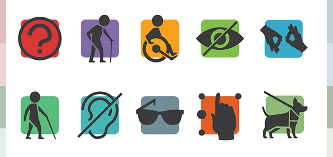
We've been running UX Design courses for over a year now and one of the segments that invokes the greatest amount of conversation is Inclusive Design. So let's dive and find out what inclusive design is about.
Inclusivity for All
Inclusive Design is championing the user, and that means all users are considered. It is integral to the experience, traditionally it is down to the UX designer to ensure that they put the user front and centre, and therefore they own the "inclusive element", but everyone on the team needs to be involved and everyone should understand its importance.
Understanding Challenges
From Product Owner to Testing, every member of the team should understand the inclusivity decisions you’ve made. You can call out accessibility issues during a sprint.
To really create engagement, invite the team to be part of accessibility user testing sessions focused on testing the accessibility of your products.
You can run your own user testing sessions by setting up an Accessibility Empathy Lab. More on that in a moment.

Challenge the Unethical
You may encounter pressure from people within the business to create designs that are considered unethical within the UX remit.
There are a few that we've seen requests for previously:
- Increase signups by using pop-ups
- Maximise upsell of add-ons
- Conflicting priorities for components, with less weight given to the action that allows the user to proceed
- Deliberately obscure the ability for users to speak to the company
You must represent the User and protect them from Dark Patterns [Design choices that are in the interest of the business, to the detriment of of the user].
Can you think of some more examples that you've seen in the wild (i.e. sign up online, but cancel over the phone using premium rate number)?
Embedding inclusivity in the organisation
1. Sell the benefits internally
Research and put numbers on how many people your inclusive design efforts will help. Can you translate this into sales or other metrics that are key to your business? As well as hard numbers, video clips or screen recordings of people struggling with an interface can be very convincing.
2. Create a user group within your organisation
If you are working for a large company, you hopefully have a whole spectrum of people who can review and provide feedback on your designs, giving their unique stories and points of view. Create a user group and consult with them regularly to ensure their voices are heard.
3. Run an Accessibility Empathy Lab
Consider running an open and interactive session which can be lead by your user group. Here you can use a range of tools to emulate different challenges that users may have when using your products.
We have run sessions before where there have been:
- browser plugins to emulate different types of colour blindness
- using gloves to restrict hand movements
- showing how to enable adaptive tools like built-in screen readers
- holding a doll to limit movement
For more ideas, check out GDSs example: https://gds.blog.gov.uk/2018/06/20/creating-the-uk-governments-accessibility-empathy-lab/

4. Create inclusive personas
Personas are a way to ensure that teams are keeping different user types in mind when making design decisions. Consider creating a set of personas that specifically represent people with different challenges and levels of ability. As with all personas, ensure that they are informed by research - user observation, interviews and other data.
5. Bring in help
If the budget allows, bring accessibility auditors or testing agencies in at various stages of a project or feature development. They can review and test your designs and your engineers' code at an early stage, and review the final build to ensure that nothing slips through the cracks.
Accessibility and SEO
There is a close correlation between usability and accessibility. Accessibility measures improve the experience for all users. So much so that your site's accessibility has a direct impact on your SEO.
Let's talk about the great reason for doing it
Digital products should work for everyone. The aim should always be to ensure that these work for a wide range of different users' abilities. Some users have permanent disabilities and rely on using assistive technologies, some are temporary, and some are situational.
If we don’t intentionally include the risk, we will unintentionally exclude. The knock on would be that your users are left frustrated and demeaned due to a lack of accessibility considerations.
A truly inclusive design means that accessibility is baked in from the start, not modified for different groups. Inclusive design has to be at the heart of the product development process.
Another good reason to do it
It is also a legal requirement. In terms of corporate responsibility, this one can sometimes carry more weight when trying to adopt change within the organisation. There are several pieces of legislation that need to be considered when developing a digital product:
1. GDPR
The General Data Protection Regulation was introduced in 2016. It’s a European law that prompts transparency around the collection, use, sharing, and storage of user data. This affects how any company collects data from people within the EU and impacts how digital products collect data and needs to achieve consent for how that data is used. As you may be designing those form fields, this affects you.
2. Equality Act
The Equality Act 2010 is a UK law that aims to ensure equality of opportunity regardless of their characteristics (including but not limited to: Ability, Race, Religion, Age, Gender) and covers online services. It specifies that organisations should take reasonable steps to make online services accessible and not discriminate against any of the protected groups by not allowing access to their product or services.
3. Americans with Disabilities Act
Introduced in 1990, this US law ensures that Americans can access goods and services regardless of ability. This covers many private and commercial services, not just the public sector (lawsuits of note were beyonce.com and dominos.com).
What are the rules?
The Web Content Accessibility Guidelines (known as WCAG, pronounced "Wack-Ag") are an internationally recognised set of recommendations for improving web accessibility. They explain how to make digital services, websites and apps accessible to everyone, including users with impairments to their:
- vision - like severely sight-impaired (blind), sight-impaired (partially sighted) or colour blind people
- hearing - like people who are deaf or hard of hearing
- mobility - like those who find it difficult to use a mouse or keyboard
- thinking and understanding - like people with dyslexia, autism or learning difficulties
The WCAG guidelines sets the benchmark, defining the level of compliance:
- A - minimal and generally not sufficient
- AA - good - aim for this as a minimum across the site/product
- AAA - excellent - this is the highest level but it’s almost impossible to achieve this for all aspects of a site/product
Guidelines - Some considerations
The guidelines overlap with the core UX principles, which reinforces the correlation between inclusivity and usability both being key drivers to achieving great design for all users:
1. Write in plain language using everyday words, don’t reply of figures of speech or metaphors
Consider content complexity and readability (is what’s being written clear, concise and succinct? is the line-height comfortable?)
2. Use lists, Short Sentences, Regular Headings and Paragraph Breaks - avoid walls of text
- Text size and contrast (don’t rely on pale placeholders in inputs to convey information)
- Heading structure (ensure your content hierarchy follows a logical structure, and that you don’t use Headings for style alone)
We talked in depth about Why headings are important in one of our other blog posts.
3. Where possible use diagrams and illustrations to communicate information
Use of colour (don’t rely on colour alone to convey important information). Deuteranopia sufferers have problems distinguishing between RED and GREEN. When used in product design, the temptation to give a positive message a green background and an error message a red background will mean little to these users.
4. Use "alt text" & captions
- Always provide accurate alt text to useful or contextual images. Imagine trying to describe the image to someone; those are the words to use.
- Don’t add alt text to decorative images
- Text alternatives for audio and visual information (captions for the win)
5. Make your CTA text descriptive to ensure that it’s clear what the action will perform
Hit area sizes and text labels for interactive elements
6. Support autocorrect/autofill to help speed up the interaction
Keyboard navigation and consequent tab order
7. Add Hover and Active states
Ensure that it’s clear where the interaction is happening
8. Make Tabular data readable
Plenty of spacing, borders and appropriate alignment
9. Consider how the interface works when zoomed
Don’t disable the zoom, ever.
Final thought
There are many facets to consider when designing and developing something that is 100% accessible, and sometimes these ideals may seem to conflict with business goals or product strategy. But you need to seize the opportunity to share the incredible benefits of being accessible first, and if you bring everyone on board, you'll find that instilling user empathy spreads the ownership and understanding far further than taking on the task solo.
Do you agree? What is your experience in the wild?


