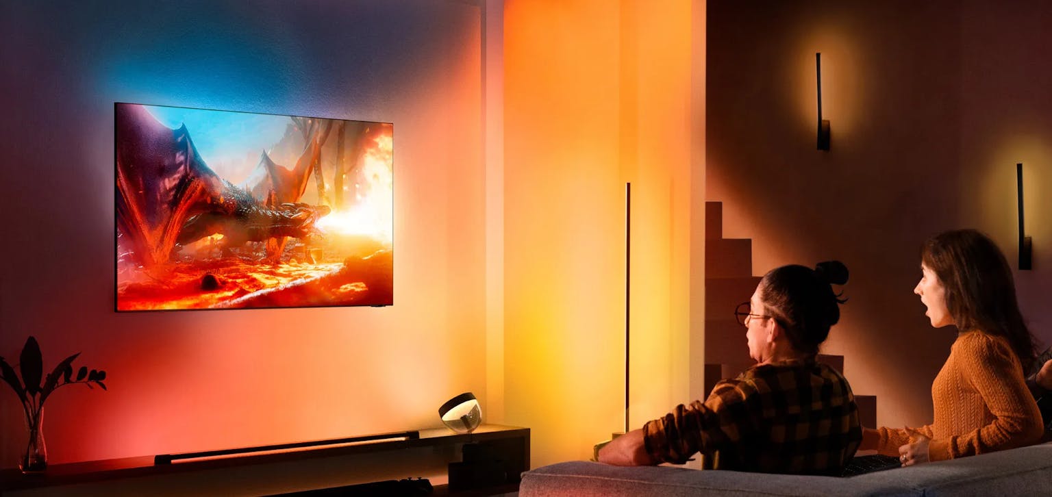
I’m a self-proclaimed tech fiend. Any spare cash I have goes toward something new and cool-smart lighting in every room, HomeKit-programmable inverters for my solar panels, or even voice-controlled blinds for my bedroom windows. Among all this cutting-edge tech, one element has always intrigued me: the immersive backlit TV.
Twenty years ago, Philips popularised the backlit TV with their Ambilight technology. Whether you love it or hate it, it’s inspired countless copycat and add-on products, like those from Govee. But what if you could replicate this effect on a website?
A few months ago, I stumbled across a video by Wes Bos showing how to create a “backlight” effect for almost any web element. What amazed me most was its application for videos. Let’s dive into how you can recreate this mesmerising effect for both background images and any element -even videos- using CSS and SVG filters.
Creating a Backlight Effect for Background Images
Creating a backlight effect for background images is straightforward. The idea is to duplicate the element, blur it, and position it behind the original. Here’s how:
// Create your background image
.backlight {
  background:url('https://www.thejuniperstudio.com/juniper-logo.png') no-repeat;
  height:242px;
  width:800px;
  background-size:cover;
  position:relative;
}

// Duplicate, make it blurry
.backlight:after {
  content:'';
  width:100%;
  height:100%;
  top:0;
  position:absolute;
  background:inherit;
  filter: blur(20px);
  z-index:-1;
}
This works beautifully for background images because the background: inherit property allows the duplicate to use the same background as the original element.
(Codepen - Blurred Background Image)
Extending the Backlight Effect to Any Element
What if you want to apply the backlight effect to elements like images or videos? This is where SVG filters come in handy. With SVG, you can achieve the same duplication and blur effect by referencing the original source graphic.
Step 1: Create an SVG Filter
Here’s how to define the filter:
<svg width='0' height='0'>
  <filter id='blur-and-scale' y='-50%' x='-50%' width='200%' height='200%'>
    <feGaussianBlur in='SourceGraphic' stdDeviation='40' result='blurred' />
    <feColorMatrix type='saturate' in='blurred' values='4' />
    <feComposite in='SourceGraphic' operator='over' />
  </filter>
</svg>
Here’s what’s happening:
- Gaussian Blur: Creates the blur effect. Adjust the stdDeviation value to control the spread of the backlight.
- Color Matrix: Saturates the blurred graphic. A value of 4–5 works well for most cases.
- Composite: Overlays the original graphic on top of the blurred background.
Step 2: Apply the Filter in CSS
Next, use the filter in your CSS:
.filter-blur {
  filter: url(#blur-and-scale)
}
Step 3: Apply It to a Video
Finally, you can use the filter on an embedded YouTube video (or any other element):
<iframe
class='filter-blur'
width="1280"
height="720"
src="https://www.youtube.com/embed/A3ZZj5y6Qt4"
title="IDLES - DANCER  (Official Video)"
frameborder="0"
allow="accelerometer; autoplay; clipboard-write; encrypted-media; gyroscope; picture-in-picture; web-share" referrerpolicy="strict-origin-when-cross-origin"
allowfullscreen
/>
CodePen - Video Backlight - (Philips Hue)
The Final Result
When implemented, this technique creates a stunning backlight effect that enhances the visual appeal of your web elements, from images to videos. It’s a simple yet powerful way to make your content stand out.
Whether you’re a fan of immersive tech like Ambilight TVs or just looking for a creative CSS trick, this backlight effect is a great addition to your toolkit.


